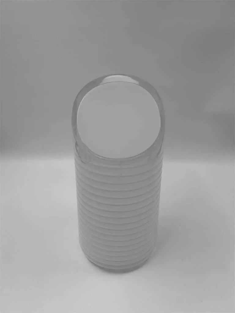
Acrylic partition work looks simple from the concept sketch — it’s a clear plane in space — and that’s exactly why it goes wrong in specification. A partition is really a panel plus a mounting condition, and the mounting condition decides nearly everything: the hardware family, the edge spec, the thickness conversation, and what has to be true about the building before anything can be fabricated. This guide walks the spec in that order.
The taxonomy: four mounting conditions
Full-height fixed panels run floor to ceiling (or counter to ceiling) captured in channel or held on patch fittings. Captured edges disappear into the hardware; exposed edges don’t. The building interface — what the channel fastens to at top and bottom — is the first question, not the last.
Freestanding dividers stand on weighted or bolted bases. Everything about them is a stability conversation: base footprint versus panel height, where people brush past, whether the floor is level. They’re also the most forgiving to install, because they don’t need the building to cooperate.
Desk- and counter-height screens mount on brackets and clamps. They live at hand height, get touched constantly, and are the clearest case for specifying the edge finish deliberately — these edges are at eye level and under fingertips all day.
Suspended panels hang from above. They involve the ceiling structure, which means they involve the building’s trades, sequencing, and whoever owns what’s above the ceiling tile — coordinate early or redesign late.
Thickness: the honest version
Every partition conversation arrives at “how thick?” and the honest answer is that no single table settles it, because the mounting condition changes the question. A panel captured in channel on multiple edges is stiffened by its capture; a point-supported panel of the same size carries itself between fittings and wants to be thicker. What drives the decision is qualitative and consistent: unsupported span, panel height, how much the panel will be pushed and leaned on, and how solid it has to feel — a partition that visibly flexes when a door closes reads as flimsy even if nothing is wrong with it.
For the numbers themselves, the right sources are the sheet manufacturer’s published engineering data for the material, and the quote review itself: when something about a panel’s size against its mounting looks off on a drawing, we say so before it’s built. The design call stays with the designer — what the shop adds is a second set of eyes that has seen where these go wrong. Thickness also has a visual dimension worth using on purpose: thicker sheet reads more like architecture and less like fixture, which is sometimes the entire reason it’s specified.
Privacy without opacity
The useful range between “window” and “wall” is where acrylic partitions earn their keep:
- Frosted panels pass light while breaking the image. Gradient frosts — clear at seated eye level, private above, or the reverse — can be produced as printed effects, or as film applied by others, and they’re the workhorse of open-office division.
- Transparent tinted panels mark territory without giving up the view; a bronze or gray tint divides a room visually without darkening it the way a wall would.
- Printed patterns turn the partition into a graphic surface. One thing to check in design: how the pattern reads with light behind it, because a partition is backlit by whichever side is brighter, and a pattern chosen from a flat proof can behave differently in place.
Edges: captured versus exposed
Spend the edge budget where edges show. A captured edge buried in channel needs to be clean and dimensionally right, nothing more; an exposed edge on a freestanding divider or desk screen is a visible design element at conversation distance and should be specified by name from the Edge Finishing Standards. Writing “polished edges” across a whole partition package pays for finish nobody will ever see; writing the method per edge class is the same discipline the acrylic-versus-glass decision rewards everywhere else in architectural work.
Field dimensions: the discipline that makes install day boring
Partitions meet real buildings, and real walls and floors are neither plumb nor level. Two habits prevent nearly all partition install problems:
Measure after the conditions exist. A partition dimensioned from drawings meets a building that has since gained flooring, wall finishes and a reality of its own. Field dimensions — supplied by the customer or their contractor, taken once the surfaces the partition touches actually exist — are the input the fabrication drawings should be built on. Shop drawings are where those numbers get locked and signed.
Let the hardware absorb the building. Channel depth, patch-fitting adjustment and base leveling exist to take up the difference between the drawing and the site. Designing with adjustable hardware allowances — rather than asking a rigid panel to meet an out-of-plumb wall exactly — is what our Fabrication Tolerances standard pairs with: the panel is held to its tolerances, and the hardware handles the building’s.
One boundary to keep clean: where a partition has code implications — egress, accessibility, anything a jurisdiction cares about — compliance is the customer’s specification to make, and we build to it. The broader context for acrylic in interiors lives in the architectural and interior guide; for a partition package with real dates attached, start the conversation while the field dimensions are still schedulable.