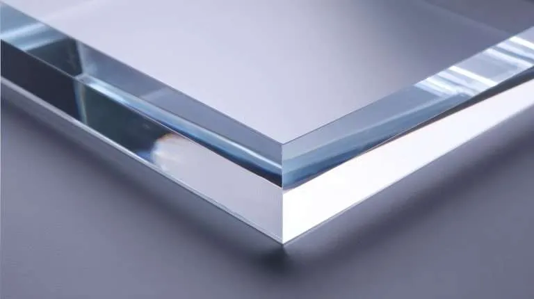
Here is the insight that reorganizes how you spec a cut letterform, and it is worth stating before anything else: on a dimensional letter, the face is flat and the edge is the product. Walk past any lobby wall — the letter faces are a color; everything else you perceive about the sign’s quality is edges. Their gloss, their consistency stroke to stroke, whether the inside of the “e” matches the outside of the “S.” Which is why the single most consequential line in a dimensional-letter spec is the one most specs omit: the edge finishing method, named, per our published Edge Finishing Standards — because an edge left to shop discretion is the product left to shop discretion.
Cutting method follows the letterform
The typeface largely picks the process:
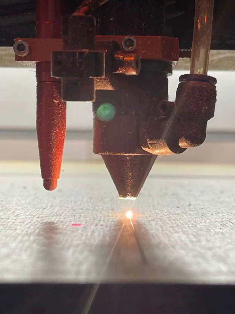
- Laser cutting owns fine work: serifs, small counters, script faces with hairline connections, logotypes with tight interior detail. The beam turns corners a cutter body cannot, and it leaves its characteristic glossy cut edge straight off the machine. It is typically most effective on thinner stock — which suits fine letterforms, since delicate faces read best at modest depths anyway.
- CNC routing owns thick-stock letters, large-format letterforms, and profiles that want a radiused or shaped edge. Heavy sans-serif capitals cut from thick sheet — the standard lobby-sign move — are router territory, with the machined edge then finished to the specified method.
Both processes have real minimums on stroke width and counter size — a hairline serif that draws beautifully at poster scale may simply be too fine to cut and survive handling at door-sign scale. The minimums depend on process, material, and thickness, so treat them as a file-review conversation: send the artwork and the intended sizes, and the feasibility of the smallest letterform comes back with the quote rather than as a surprise after it.
Depth, proportion, and the laminated cheat
Letter depth against cap height is a proportion decision the eye judges instantly, even untrained: too shallow and the sign reads as flat graphics pretending; too deep and small letters go slab-like, all edge and no face. The working pattern is proportional — larger letters carry more depth gracefully, and a letter set should scale its depth with its size rather than reusing one sheet thickness across every scale.
When a design wants more depth than single-sheet stock provides, lamination is the honest route: layers bonded face-to-face and machined as one. Done well it also opens a design move — contrasting layers (a clear body behind a colored face, a dark reveal line inside a light letter) that turn the edge into an intentional detail. Done casually it shows every glue line on the most visible surface of the sign, so lamination raises the stakes on the edge spec rather than lowering them.
Color, ranked by durability and rework cost
Four routes to a colored letter, ordered by how the color survives:
- Pigmented sheet — color all the way through the body. Edges match faces automatically, scratches reveal more of the same color, and there is nothing to peel or fade off. The most durable route and the first one to consider when the palette allows.
- Second-surface print on clear — the graphic printed in reverse on the back, viewed through the material. The acrylic itself becomes the protective layer; faces clean without touching ink. The route for photographic or multi-color faces that must last.
- First-surface print — printed on the front. Full graphic freedom, fastest turnaround, and the ink lives where the world can reach it — fine at mounting heights hands don’t visit.
- Painted faces — the traditional route, still right for certain finishes; the coating is the wear item and touch-up is part of its life cycle.
Whichever route carries the brand color, the process commitment is the same: color-managed CMYK printing matched to the customer’s brand references, proof-approved before the run. On letter sets this matters double, because a set is many parts that must agree — and a fleet of letters approved against one proof does.
Mounting: where the install is won or lost
- Stud mounting — threaded studs bonded or machined into the letter backs, set into drilled holes in the wall. The workhorse for permanence and clean shadow lines.
- Standoff pins — projecting the letters off the wall on visible barrels, creating a deliberate shadow gap that halo lighting or strong downlight turns into part of the design.
- Flush adhesive — for smooth surfaces and lighter letters, where drilling is unwelcome; the surface and its preparation become part of the spec.
The unglamorous deliverable that decides how install day goes: the paper pattern. Every letter set ships with a full-scale install template — tape it level, drill through the marks, and a twelve-letter wall goes up straight in one pass. Letterforms are unforgiving of placement error (a stroke’s worth of drift reads across the room), so the template is not a courtesy; it is the mounting system’s other half.
Letters are families, not parts
A logo rarely gets cut once. It becomes the lobby version, the directional version, the door-scale version — one mark at three sizes, expected to read as one mark. Keeping proportions, depth ratios, colors, and edge treatment consistent across sizes is partly design discipline and partly a dimensional-control conversation: multi-part sign families are exactly the work our published Fabrication Tolerances standard exists to make specifiable, with critical dimensions flagged and process bands stated instead of assumed.
The compact spec, then, for any dimensional letter order: artwork as vector · sizes per location · depth per size · cutting process (or “recommend per letterform”) · edge method, named · color route · mounting system and surface. Seven lines, and the sign your visitors judge by its edges is the sign you actually specified. Send the mark and the wall — or see finished letter work in the gallery to calibrate depth and edge choices against real installs.