A render is a physics-free environment, and that is what makes it good at its job. Corners can be infinitely sharp, panels can have no thickness, a shelf can cantilever off nothing, and two surfaces can meet with no evidence they were ever separate. Visualization tools model surfaces, and a surface has no material behavior to argue with. The render sold the idea.
At a shop, every one of those freedoms becomes a decision. Acrylic design for fabrication is the work of making those decisions on purpose rather than by default — a translation that happens on nearly every custom program, and one that goes better with the people who own the intent in the room.
The Translation Catalog
Five substitutions account for most of the distance between a rendered concept and a fabricated one. Each has more than one solution, and choosing among them is a design decision.
Seamless monolithic forms become formed parts or bonded assemblies
A continuous shell in a render has no joints because nothing required it to be made. Acrylic reaches that look two ways. Thermoforming heats flat sheet to forming temperature and lets it take shape over tooling — line bending for crisp single-axis folds, drape forming for curves and wraps, vacuum forming for deeper dimensional geometry. Formed parts have no seams, which is why a wrapped front or a domed cover usually wants forming. The trade is dimensional: a formed part holds roughly ±3 to ±5 percent of the formed dimension, per our Fabrication Tolerances standard — looser than machining, because the material stretches and relaxes as it takes shape. Where a formed feature must mate precisely with a machined one, that difference is designed for, not discovered.
Where geometry, part size, or thickness puts forming out of reach, the shape is cut and joined. Solvent bonding chemically fuses mating acrylic faces into one continuous piece; UV-cure adhesive gives a water-clear bond line with controlled cure timing. Both can read as near-invisible, and both are held to a criterion written before assembly rather than judged after, published in the Joint Clarity standard.
Keeping the intent means deciding where the joints fall rather than inheriting them. A bond line placed on an axis the viewer never reads, or aligned with a design line so it looks deliberate, preserves the monolithic impression better than a joint chosen for shop convenience.
Knife-edge corners become a radius plus an edge method
A zero-radius corner exists in a surface model because there is no material to occupy the corner. Real acrylic has one: a formed bend carries an inside radius governed by thickness and forming method, and a machined internal corner carries the radius of the cutter that made it. Those are geometric consequences, not shop preferences — a router bit cannot cut a corner tighter than its own radius, so a rendered square notch becomes a notch with rounded internal corners unless the design routes around it.
The radius and the edge’s appearance are separate levers. What makes a rendered edge read as crisp is how it catches light, and that is an edge-finishing decision. The Edge Finishing standard names six methods — raw/saw-cut, sanded, laser-cut, flame-polished, buff-polished, and diamond-polished. A diamond-polished edge reads as glass and throws a bright line; a sanded edge reads as a soft drawn one. A small radius with a polished face often looks sharper than a tighter radius left dull — the eye reads the light, not the geometry.
Impossibly thin planes become thickness by span
Thickness in a render is a rendering choice. In material it is what resists deflection, which scales with unsupported span and applied load. A plane that reads elegantly thin at a short span bows visibly at a long one under its own weight, before any product is placed on it.
Thickness also carries the look, not just the load. The edge reveal, the way light travels along the sheet and glows at the edge, the shadow depth under a shelf — those exist because the material has a dimension, so a change made for stiffness lands on the appearance too. A specified thickness is treated here as an effect to protect, not a number to adjust quietly. One consequence worth knowing before detailing around it: acrylic sheet is manufactured to a thickness tolerance of about ±10 percent of nominal, so a quarter-inch sheet is legitimately not 0.250 inches everywhere. Slots, dados, and reveals that assume the nominal number bind or rattle; they are designed to the tolerance instead, which is a fabrication-drawing detail your fabricator should be raising, not you.
There are three levers when a span wants more than the drawn thickness gives. Increase thickness where the eye reads it as substance rather than bulk. Shorten the unsupported span with a support that stays out of the sightline. Or stiffen the section instead of the sheet — a formed return along the back edge adds rigidity while the visible edge stays thin.
Floating elements become a concealed-support repertoire
Cantilevers and floating shelves are where a render diverges most visibly from reality, and fabrication has its deepest bench of answers here. Standoffs and hidden fasteners carry load from behind. A clear support fin bonded on a non-viewed axis disappears into the assembly. A back panel bonded into a structural spine lets the visible element cantilever from something the viewer reads as background. Slots and edge capture hold a panel with no visible fixing at all. Where a joint carries real load, comes apart for shipping, or needs service on site, mechanical fastening or a hybrid of fastening and bonding is the correct answer, not a compromise.
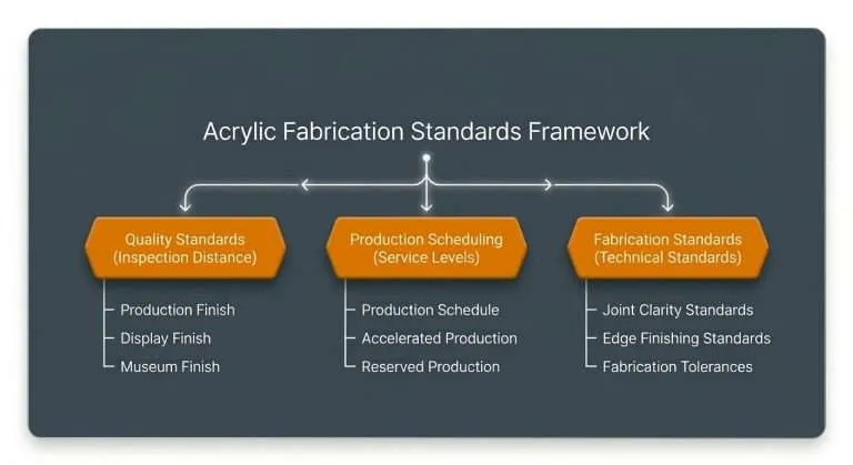
“Invisible” is not absolute — it depends on how close the piece is judged from. That is the logic of the Acrylic Quality Standards, where the grades are separated by Inspection Distance: Production finish is judged from roughly four feet, Display from about two, Museum Archival from about one. A support detail that vanishes on a retail floor at four feet is a different specification from one facing arm’s-length scrutiny in a vitrine — and specifying a whole build at the closest grade any single surface needs spends budget where no one will ever look.
Gradients in the material become sheet choice or printed decoration
A render applies a gradient to a volume as easily as to a face. Material color does not work that way. Color either belongs to the sheet — clear, colored, frosted, and mirrored grades, uniform through the body — or it is applied to a surface as decoration. UV printing handles the applied route in color-managed CMYK matched to your brand references and proof-approved before the run, with white ink laid as a flood or under-base so colors hold density on transparent or dark substrate. Printing to the second surface puts the graphic behind the acrylic, so the sheet becomes the gloss layer and the ink rides protected.
The concession worth making plainly: a smooth transition running through the thickness of the material is not something sheet acrylic does. Bonding tinted layers into a stack approximates a stepped transition, but the steps show up close. If a through-body color transition is the concept’s whole point, acrylic sheet is the wrong medium for it, and concept stage is when to hear that. Finished work in the gallery calibrates what the sheet-color and printed routes actually look like faster than any description.
The Job Is to Protect What the Design Was For
Every translation above has multiple solutions, and choosing among them requires knowing what the design is for. If the governing idea is weightlessness, the engineering conversation is about which support strategy best preserves weightlessness — not about whether weightlessness is achievable. If it is a single unbroken surface, the question is where a joint does least damage.
That framing is something agencies should expect and ask for by name. A fabricator who answers a concept with “that can’t be built” has answered the geometry and ignored the brief. A useful answer states the intent back to you first, then offers the routes to it with their trade-offs attached.
The most useful thing a fabricator can be told early is which of proportion, transparency, seamlessness, and edge quality is non-negotiable. Trade-offs get made on every program, and a ranking supplied up front lets them be spent where the design can afford it and held where it cannot.
When to Invite the Translation
The cost of this conversation is set almost entirely by when it happens. A feasibility review run while the concept is still an idea changes ideas — nothing has been sold, so nothing has to be unsold. After client approval, the same findings become a conversation about a concept the client already loves, with the producer holding the difference. After tooling, they become money and calendar.
Schedule behaves the same way. Translation absorbed at concept stage consumes no production time; discovered late, it consumes the schedule directly — at which point it matters that Reserved Production is the only Production Scheduling tier that guarantees a ship date, a better conversation to have while a concept is still moving than after a date has been promised to a client.
Nothing formal is needed to start — a render, sketch, reference image, or physical sample is enough. For quoting, PDF is preferred and DXF or DWG are accepted; artwork travels as AI, EPS, SVG, PNG, or JPG. CAD is not a prerequisite; closing that gap is fabrication’s job, not the agency’s.
What a Buildable Spec Actually Contains
The output of a good translation is a document both sides can build and check against. A buildable acrylic spec names all of these:
- Dimensioned geometry — overall and part-level dimensions, with the datum identified and critical dimensions marked apart from reference.
- Material and grade — cast or extruded acrylic and why, plus color family: clear, colored, frosted, or mirrored.
- Thickness per part — stated part by part, noting where it is set by span and load and where by how the edge should read, with mating features detailed to the sheet’s manufactured tolerance rather than its nominal.
- Formed geometry — bend lines, radii, draw depth, forming method, and which face is the cosmetic face.
- Finish grade — Production, Display, or Museum Archival from the Quality Standards, set by viewing distance, and allowed to differ between customer-facing and structural surfaces.
- Edge method per edge — named from the Edge Finishing standard; edges need not all match, and specifying them individually is both an appearance lever and a cost lever.
- Tolerance references — which dimensions are held to which published ranges: laser-cut features to roughly ±1/32 to ±1/64 inch, CNC-routed to about ±1/32, saw-cut and assembled dimensions to ±1/16 to ±1/8, thermoformed geometry to its percentage band — per the Fabrication Tolerances standard, so the drawing asks each process for what it can hold.
- Joining method per joint — solvent, UV-cure, mechanical, or hybrid, with the load and serviceability expectation behind it.
- Joint clarity criterion — the criterion each visible joint is held to, from the Joint Clarity standard, written before assembly.
- Decoration and artwork — print method and placement, first or second surface, white ink as flood or under-base, color as color-managed CMYK matched to your brand references and proof-approved.
A spec carrying those fields survives handoffs, quotes consistently, and reorders without a fresh round of interpretation. It also lets an agency defend the concept later, because every decision that shaped the build sits next to its reason.
Have a concept that needs a feasibility read before it goes to a client? Send it over — a render or a sketch is enough to start the conversation.