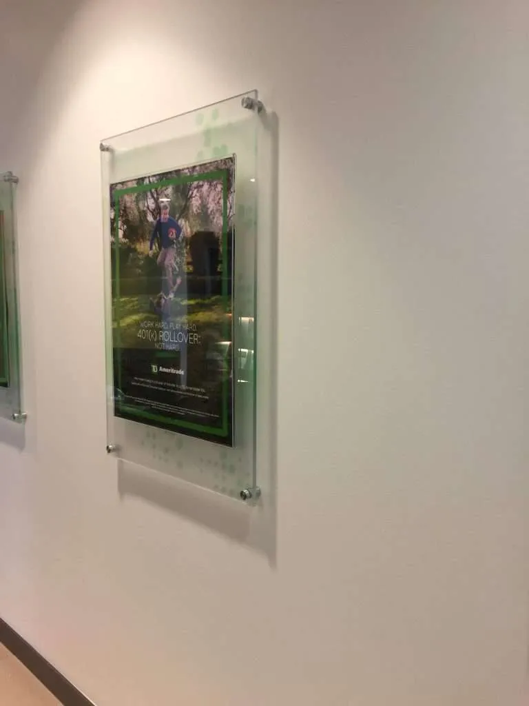
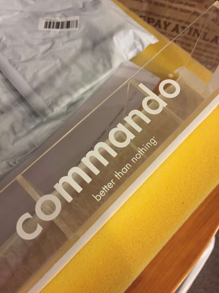
There is a sign finish buyers point at without knowing its name: the graphic that seems to float inside the panel, glossy and dimensional, like artwork trapped under glass. That is second-surface printing. The graphic is printed reversed on the back face of the acrylic, and viewed through the sheet — so the acrylic itself becomes the finish, its polished front surface standing between the world and the ink. First-surface printing, by contrast, puts the ink on the front where you can touch it; everything distinctive about the second-surface look follows from moving the image to the far side of the material.
The layer stack, in printing order
Second-surface work is a build-up, laid down in sequence on the back of the sheet, and a designer who understands the stack can spec it deliberately:
- Reversed art. The image prints mirror-flipped, because it will be viewed from the other side of the sheet. (Artwork is typically supplied as designed — the mirror flip happens in production, not in the design file.)
- The color layer. Full-color UV-cured ink, printed directly on the back face.
- White ink. On a transparent substrate, color with nothing behind it goes translucent and dim — the light passes through instead of bouncing back. White ink solves this, applied behind the image as an under-base (white only behind the printed areas, leaving clear acrylic clear) or as a flood (white across the whole back, making the panel read opaque from the front). The choice between under-base and flood is a real design decision: it determines which parts of the panel stay transparent.
- Optional backing. A final backing color or blockout layer where the application needs the back of the stack sealed from view or from light.
What second-surface buys in service life
Durability is the practical argument. On a second-surface panel, every hazard arrives from the front — cleaning, touching, scuffing, the daily traffic of a lobby or a retail wall — and every one of them hits acrylic, not ink. The graphic lives behind the full thickness of the sheet, protected by the very material it is printed on. The honest limits: the panel’s edges and the back of the print stack still need protection decisions in wet or high-abuse locations — an exterior or splash-zone installation should specify how the back and edges are sealed or captured, because the protection story only covers what the sheet itself shields.
Designing for the medium
Second-surface has its own design levers, and they are worth using rather than discovering:
- Thickness is depth. The sheet thickness sits visibly between viewer and image — thicker material reads as more dimensional, more object-like. Choosing thickness on a second-surface sign is partly a structural call and partly an aesthetic one.
- Frosted backs make halos. A frosted or matte back face around an under-based image softens and diffuses what surrounds the graphic — a deliberate effect when chosen, a surprise when not.
- Polished edges. The glass-like impression is strongest when the panel’s edges carry it too — a polished edge finish on the exposed perimeter makes the whole panel read as one jewel-like object, where a raw edge undercuts it.
Color, proofs, and the view through the sheet
Color on second-surface work is managed the way all brand-critical printing is handled here: color-managed CMYK printing matched to the customer’s brand references, proof-approved. Proofs matter doubly on second-surface jobs, because the viewer sees every color through the thickness of the acrylic — the substrate is part of the optical path, so the only honest way to judge the final color is to look at a proof through the same material, at the specified thickness. Approve the proof as the sign will hang, not as the file looks on a screen.
Specifying it is simple once the technique has a name: second-surface UV print, under-base or flood, thickness, edge finish, brand references attached. Send the artwork and where it’s going — the glass-like read is a known recipe, and now you know what to ask for.