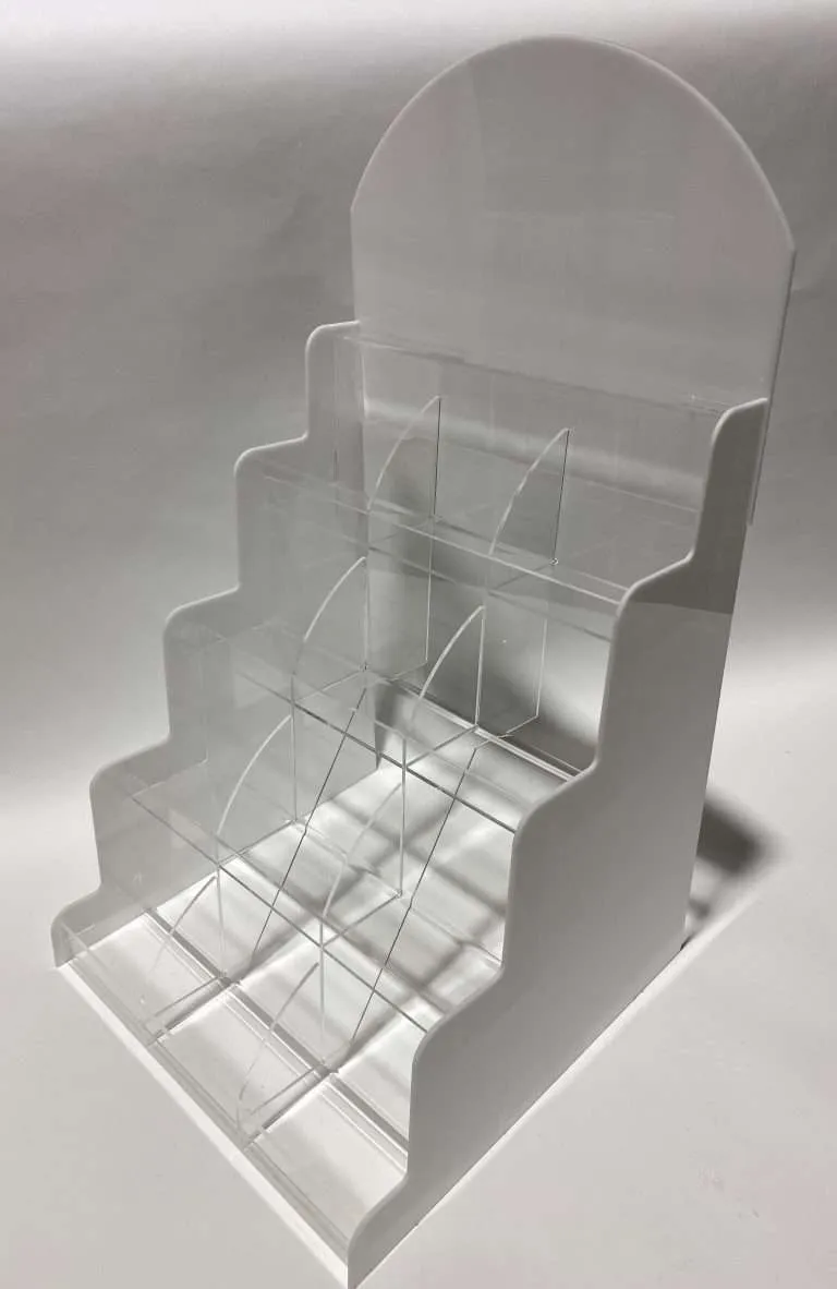
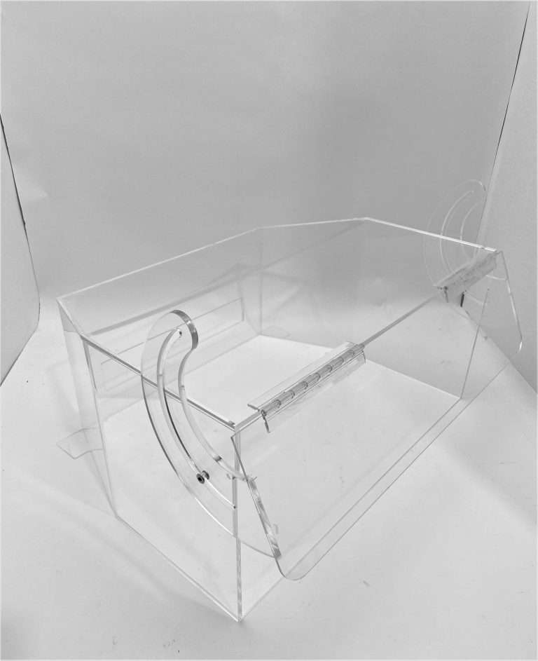
Every countertop display lives on land it doesn’t own. The counter belongs to the retailer, the inches on it are negotiated, and the negotiation happens before the design does — which is why the correct first line of a countertop display spec is not the product, not the branding, but the footprint: the maximum width and depth the placement actually grants. Get that number first, in writing if the program is serious, and design the display inward from it. Designing outward from the product produces beautiful displays that get refused floor space; designing inward from the footprint produces displays that ship.
The five numbers every countertop quote needs
A countertop RFQ that arrives with these five collapses the quoting cycle from a correspondence into a transaction:
- Footprint — W × D. The negotiated maximum, per above. This is the envelope everything else obeys.
- Overall height. Bounded on one side by shelf clearance above the counter (many placements sit under shelving or signage) and on the other by the sightline rules below.
- Product dimensions. With count per facing: the real product’s true dimensions — including caps, pumps, and label orientation — and how many units each facing holds. Wells and compartments are machined to these numbers; “roughly bottle-sized” is a redesign waiting to happen.
- Target loaded weight. What the display carries when full. This number drives structure — see the next section — and it is the one most often missing.
- Quantity per run. One prototype, twenty doors, or three hundred — quantity moves process choices, material nesting, and how the design should think about assembly.
Load drives thickness
Here is the structural truth the catalog-riser habit hides: a display holding lip balm and a display holding boxed cologne are different structures that happen to look similar. Shelf and platform thickness follows from span and load together — how far the surface stretches unsupported, and what stands on it for months. Acrylic under sustained load creeps (it keeps deflecting slowly over time, beyond the day-one sag), so a shelf that merely passes the loading-dock test can still be visibly bowed by the first reorder.
What a spec should do about it: state the load honestly (number four above) and let span-versus-thickness be answered as engineering at the quote. The two levers are the same as in all display work — step the thickness up, or shorten the span with a support or bonded rib — and on a countertop footprint, spans are mercifully short, so the answer is usually one deliberate thickness choice made once. What kills displays is not hard engineering; it is nobody having stated the load.
Sightline and shopability
A countertop display is shopped standing up, at arm’s length, from above — a geometry that produces three working rules:
- Front-face angle. Product faces tilted a few degrees up out of the horizontal meet a standing shopper’s gaze instead of the ceiling’s. Tiered and stepped layouts exist because flat rows aim labels at nobody.
- Header height. Keep the header above the product, not instead of it: the header carries the brand, the product closes the sale, and a header that forces the product down into shadow has inverted the hierarchy.
- Back-panel height. A back panel that climbs past a standing shopper’s eye level at counter height stops presenting and starts hiding — it walls the product off from a shopper approaching at an angle, and from staff seeing when it needs restocking. Tall brand statements belong on the wall or the floor unit, not the counter.
Tolerances belong on the drawing
Countertop displays are assemblies of machined parts — slotted panels, nested wells, press-fit dividers — and assemblies live or die by fit. The professional move is to dimension fit-critical features against our published Fabrication Tolerances standard rather than writing “make it fit”: defined typical ranges exist per process (laser-cut, CNC-routed, and saw-cut components each carry their own band), so a drawing can flag which dimensions are critical and which band applies. Two things this buys you: quotes that price the same object, and a prototype conversation about design intent instead of dimensional archaeology. Slot-and-tab joints in particular deserve stated clearances — acrylic sheet thickness itself varies within its own manufacturing tolerance, and slots cut to nominal thickness will fight the actual sheet.
The omissions that surface at prototype
Three questions almost never appear in first-draft countertop specs, and all three surface at the prototype review — so answer them early and skip that round:
- Counter edge clearance. Does the placement’s counter have a raised edge, a rounded bullnose, or a POS terminal fighting for the same inches? A display footprint is only real if the counter’s actual surface geometry accepts it.
- Cleaning-wipe clearance. Retail counters get wiped daily by someone holding a rag, not tweezers. Wells and dividers spaced too tight to admit a cloth collect grime in exactly the places shoppers look down into. Design the gaps for the rag.
- Ships assembled or flat? A bonded one-piece display arrives ready and crates large; a flat-pack display ships cheap and asks the store to assemble it correctly. For one flagship counter, bond it; for two hundred doors, the pack-out design is part of the display design — decide which program this is before the drawing hardens.
The spec, on one page
Footprint · height · product dims with count per facing · loaded weight · run quantity — then the sightline geometry, the tolerance callouts on fit-critical features, and the three prototype questions answered in advance. That is a complete countertop display specification, and it fits on a page. Send yours over with the real product dimensions, and see the retail and POP display work for how these decisions look executed — the formats vary endlessly; the spec discipline underneath them doesn’t.