Most signage buyers choose between engraving and printing without knowing they were choosing — the vendor’s default becomes the spec. But the two methods put a mark on acrylic in physically opposite ways, and everything a facilities manager will care about for the next decade follows from that opposition. Engraving removes material: the mark is in the sheet — permanent, tactile, monochrome by nature. Printing adds ink: full color, photographic capability, a bonded surface layer with a service life. Subtractive versus additive. Decide which physics your sign needs, and the method picks itself.
Where engraving wins
Permanence is the headline. An engraved mark cannot peel, fade to a different hue, or be scrubbed off, because there is nothing on the surface to attack — the mark is geometry. That makes engraving the default for high-touch locations and anywhere cleaning is aggressive and constant: handrail-height wayfinding, lab and plant signage, anything wiped down daily for years. It is also the method for copy that must survive decades unchanged — donor walls, dedication plaques, room numbering that outlives three rebrands.
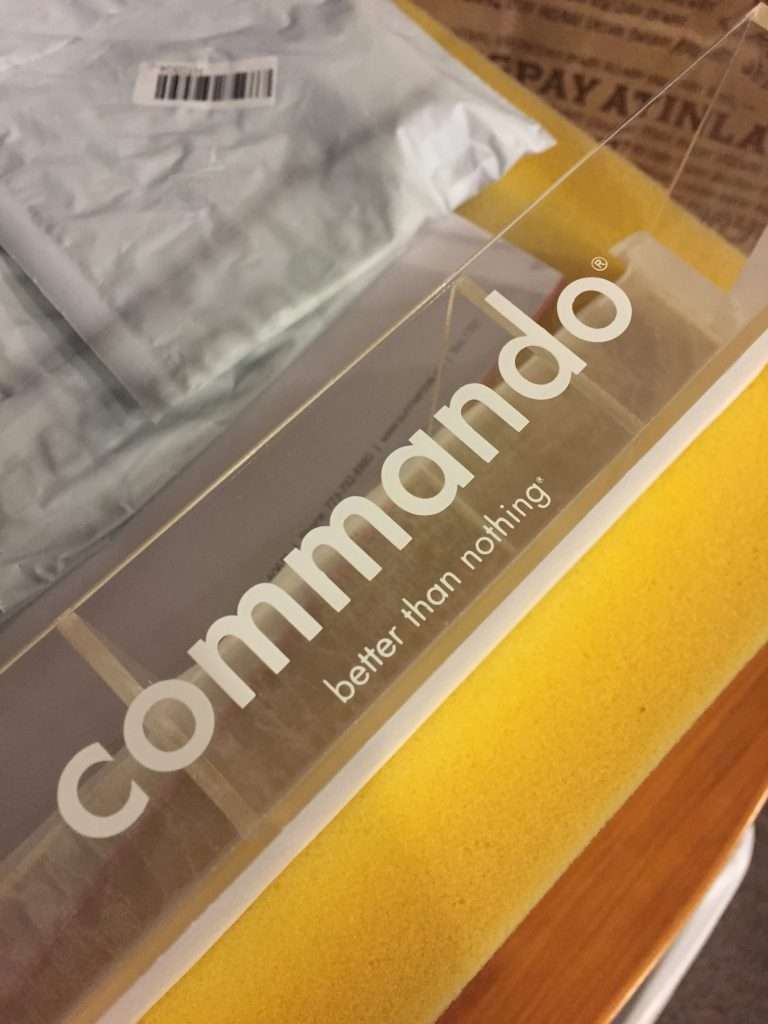
Depth is a design element, not just a mark. Machined depth catches light and shadow, reads as quality at close range, and gives a sign a physical presence flat ink cannot. When we engrave acrylic, cast sheet is the material we engrave — it engraves cleaner and sharper, and the crisp frosted mark against a glossy face is the look buyers are picturing when they say “etched.”
Engraving and edge lighting are natural partners. A frosted engraved mark scatters light; feed light into the panel edge and the engraving glows while the clear field stays dark. That interaction is the basis of a whole family of lit signs — specified in detail in edge-lit sign specification.
Contrast on an unlit engraved sign comes one of two ways, and we run both. Two-tone engraving stock carries a thin cap layer over a contrasting core, so the engraving reveals the core color at full, uniform strength — crisp copy with no ink anywhere on the sign; it fits when one of the stock color pairings suits the job. Paint-filled engraving works color into the engraved mark itself, so clear or single-color sheet can carry your brand colors in the copy, matched to your brand references.
Where print wins
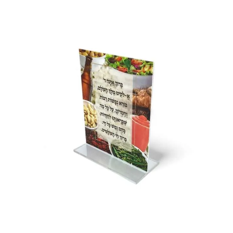
Color, full stop. Engraving is monochrome by nature; the moment the sign needs brand color, gradients, or more than one hue in the artwork, printing is the method. UV print on acrylic runs color-managed CMYK matched to the customer’s brand references and proof-approved — the full discipline of getting a brand’s color right on this material is covered in brand color matching for signage.
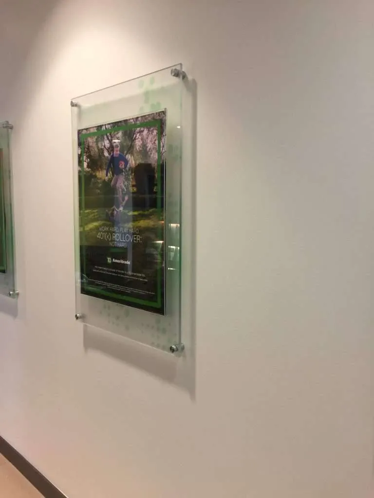
Photographic imagery and fine multi-color detail. A printed panel can carry a photograph, an illustrated map, a dense infographic — content engraving cannot render at any depth. And because the ink can go on the back face of clear sheet, the image rides protected under the acrylic with the gloss of the material in front of it; that construction and its advantages are the subject of second-surface UV-printed signage.
Changeable content iterates faster in print. Tenant directories, campaign-linked graphics, signage that updates on a cycle — printing reproduces a revised file exactly, which makes it the method for content with a shorter life than the panel it rides on. A proof is available before the run — printed on the actual material, or digital — and for color-critical work it is the step worth taking.
The honest trade: printed ink is a surface layer with a service life. Modern UV ink bonded to acrylic is durable signage-grade work, but in high-touch, harsh-cleaning or abrasive locations, an engraved mark has no surface layer to lose — which is exactly the selection logic above. (And where signage carries code requirements, it is built to the customer’s specified requirements — the code determination stays with the customer’s design team.)
The combination most buyers never get offered
The methods are not rivals on the same panel — we have engraved and printed on the same piece, and the hybrid is often the best answer: engraved room copy alongside printed full-color brand graphics; an engraved logotype over a second-surface printed field; lit signs where printed color and glowing engraved linework share one face. Designers spec hybrids because each layer of content gets the physics it needs — permanence where the copy must endure, color where the brand must show. If a sign brief contains both kinds of content, ask for both methods in one build rather than compromising either; dimensional work plays the same way, as covered in dimensional letters and logo fabrication.
Four questions pick the method
- Lifespan: must this exact copy survive decades of contact and cleaning? Engrave it.
- Color: does the sign carry brand color, gradients or imagery? Print it.
- Touch: will hands and cleaning chemicals live on this surface daily? Engraving’s mark is geometry, not a surface layer.
- Lighting plan: edge-lit panel? Engraving glows. Backlit graphic panel? That is a print discipline.
Mixed answers point at a hybrid. From there the spec conversation is short — the format questions that remain are the ones every sign answers, laid out in the lobby sign specification guide, and the fabrication details follow from the method. Name the physics your sign needs, and the rest is execution.