A reinstallation packet is usually precise about everything except the casework. The object list carries dimensions to the millimeter, mount notes, light-sensitivity flags and courier requirements — and then the vitrines that will hold all of it are described in a sentence or two of adjectives that no one can inspect against. That gap is where casework projects go wrong: not in fabrication, but in the space between what the institution meant and what the written spec actually pinned down.
This guide walks the whole sequence — object list to case type, case type to panel thickness, thickness to finish grade, finish grade to joints, joints to schedule, schedule to install — and gives you measurable language for each step. It is the sequence we run on institutional casework in our own shop; casework built here has gone to the Whitney Museum of American Art, the Herbert F. Johnson Museum of Art at Cornell University, and the New Britain Museum of American Art, and the projects that go smoothly are the ones where this sequence was written down before anything was cut.
Start with the object list, not the case
The case is a consequence, not a starting point. Everything downstream — geometry, thickness, finish grade, even the production tier — falls out of a handful of facts about the objects and the room, and the cheapest moment to gather them is before the first drawing:
- Object envelope — the largest object each case must hold, plus mount height and clearance on every side. Interior clear dimensions, not overall case dimensions, are the number that matters; wall thickness and deck build-up eat into the outside figure.
- Viewing position — where a visitor can physically stand relative to each face of each case. This single fact will later set the finish grade per surface, so record it per case, not per gallery.
- Access requirements — how often the case will be opened, by how many people, and whether rotation happens in the gallery or off the floor. Access drives case type more than any other input.
- Light sensitivity — which objects carry a UV or light-exposure restriction from your conservation team. This flags which cases need UV-filtering sheet, a material decision with a documentation requirement attached (covered below).
- The route in — doorways, elevators, corridor turns and floor loading between the dock and the gallery. A case that cannot make the turn into the gallery is a fabrication success and a project failure; the route belongs in the RFQ.
With those five facts per case, the rest of the specification is close to mechanical. Without them, every later decision is a guess that someone will have to unwind on installation week.
Choosing the case type
Institutional casework resolves into four recurring configurations. Each has a different joint map — which bond lines sit at eye height, which edges are on show — and a different access story, which is why the choice belongs early.
Five-sided vitrine
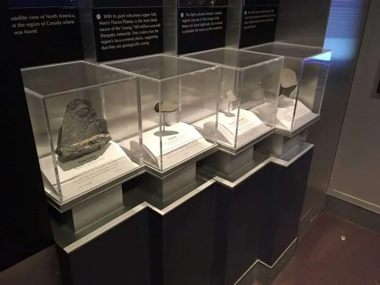
A bonded five-panel cover, open at the bottom, that sits over a deck or mount plate. It is the purest expression of acrylic casework: four vertical bond lines and a top perimeter, all potentially at reading distance, with no frame to hide behind. Access means lifting the cover clear of the objects — easy at tabletop scale, a planned multi-person lift for large floor units. Because every joint is on show, this is the configuration where joint and edge specification carry the most weight.
Bonnet on base
A five-sided cover seated on a fabricated base or plinth that contains the mount deck and, where the design calls for it, closure hardware. The seat between bonnet and base is a fit-critical detail: the cover must register consistently and sit without rocking, which makes fabrication tolerance language (below) do real work in the spec. This is the workhorse for freestanding gallery objects that rotate on a schedule.
Wall case
A wall-mounted or wall-recessed enclosure with a fixed, hinged or sliding front. The front panel is the case, optically — one large face, viewed straight on, often under raking gallery light that is unforgiving of surface variation. Hardware, framing and blocking are coordinated with the wall build, so the wall case is the configuration where the fabricator and the exhibit contractor need each other’s drawings earliest.
Freestanding pedestal case
A pedestal — acrylic, painted MDF, wood or metal per the design — carrying a vitrine cover. Structurally it is a bonnet-on-base with the base stretched to standing height; practically it is the most common unit in a gallery build-out, which makes it the configuration where consistency across a set matters most. A set of twelve pedestal cases reads as a system, and the twelfth needs to match the first — a repeatability question you can hold a fabricator to when the spec is written in measurable grades rather than adjectives.
Projects incorporate other materials as required — metal frames, wood decks, hardware — and the case type decision is where those interfaces get named, because every interface is a tolerance conversation waiting to happen.
Panel thickness: sizing the sheet to the case
Thickness is a structural and practical decision before it is a visual one. Four drivers set it:
- Panel span — larger unsupported faces need more thickness to read flat and resist bowing. A thickness that serves a tabletop vitrine honestly will visibly flex at full-height pedestal scale; span, not case importance, is what moves this number.
- Weight — thickness and area together set panel weight, and weight sets the installation plan. A large five-sided cover is an awkward, grip-poor lift; the thickness decision should be made with the install crew in mind, not just the gallery rendering.
- Edge presence — thicker walls put more polished edge on show at every corner and opening. On collection-facing work that edge is a feature, which is precisely why its finishing method needs to be named rather than assumed.
- Stability over time — casework lives for years and gets leaned on. Thickness bought at the spec stage is the cheapest insurance the case will ever get.
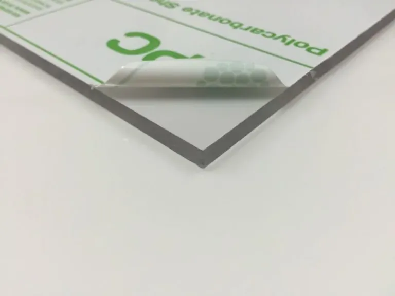
One tolerance fact belongs in every casework spec because it bites at exactly one detail: sheet thickness typically runs approximately ±10% of nominal. Where a cover seats into a routed channel or a rabbet, a groove cut to the nominal thickness can bind or rattle against the sheet that actually arrives. The correct practice — ours, and the one to require of any fabricator — is to cut seating details to the measured thickness of the production sheet, not the number on the label. It is a one-line drawing note that prevents the most common fit complaint in bonnet-and-base work.
Cast acrylic is the conventional sheet for collection-facing casework, and where your team has a material preference — cast or otherwise — we honor it where practical. What we will not do is dress a material choice in performance claims that the data sheet does not make; the sheet manufacturer’s documentation is the reference, which brings us to the material decision that carries the most paperwork.
UV-filtering acrylic: specify from the data sheet, file the documentation
For light-sensitive objects, UV-filtering acrylic grades exist from the major sheet manufacturers, and they are the conservation-driven default request for those cases. Here is the part that matters for a registrar’s records: filtering performance is a property of a specific manufacturer’s product at a specific thickness, published on that product’s data sheet. It is not a property of “UV acrylic” as a category, and it is not a number a fabricator should be quoting from memory — ours included.
So specify it the way your records will need it later:
- Name the requirement, not a number, in the RFQ: UV-filtering sheet for the flagged cases, performance per the manufacturer’s data sheet, product to be identified in the quote.
- Get the product identified in writing — manufacturer and product line — so your conservation team can pull the actual data sheet and judge the published performance against the exhibition’s light policy before fabrication starts.
- Request lot documentation with the order — ask the fabricator to pass through the manufacturer’s documentation for the material actually used, so the installed panel ties back to a data sheet in your object file, not to an adjective in an email.
This is more paperwork than most casework RFQs carry, and it is worth every line. Ten years from now, “the case is UV-filtering” is a claim; a filed data sheet and lot record for the installed panel is evidence.
The finish grade: write “Museum Archival,” not an adjective
The industry’s usual adjectives for collection-facing casework are unmeasurable — no viewing condition, no defect list, no acceptance criterion. Any shop can award them to itself, and none of your staff can inspect a delivered case against them. The replacement is a graded standard with a number attached: the Acrylic Quality Standards define finish quality by inspection distance — the distance at which cosmetic characteristics may become visible under normal viewing conditions. Three grades sit on the scale:
- Production Finish — inspected at approximately 4 feet; the working grade for commercial fabrication, honest about tolerating minor micro-bubbles within adhesive joints and slight edge variation visible only up close.
- Display Finish — inspected at approximately 2 feet; tighter joint clarity and more consistent edge finishing, for work visitors view closely but do not lean over.
- Museum Archival Finish — inspected at approximately 1 foot; the top of the scale, defined by extremely high joint clarity, highly consistent edge polishing and minimal visible cosmetic variation.
For collection-facing surfaces, the words to put in the drawing are Museum Archival finish per the published Acrylic Quality Standards. That sentence retires the adjective it replaces, and it converts acceptance from an argument into a procedure: stand at approximately one foot, look, record. Your preparator can run that inspection at delivery without the fabricator in the room, and run the same inspection at a condition check years later.
Grade by sightline, not by object value. The viewing-position notes you gathered against the object list now pay off: a tabletop vitrine visitors lean over takes Museum Archival on every reachable face; an elevated case behind a stanchion line may honestly take Display on the cover; back-of-house enclosures are often Production-grade work, correctly. Mixed grading within one case — top and front faces at one grade, rear and interior structure at another — is normal, and easy to write once the grades have names. Specifying the top grade everywhere is not rigor; it spends finishing labor where no one can stand.
What “seamless” should mean in writing
“Seamless” is the most requested word in casework and the least specified. Every bonded case has joints; what the word is reaching for is that the bond lines read clean at the distance the case will be viewed from. That is a specifiable thing — so specify it.
Bond lines are governed by the Joint Clarity standards, which give the bond line its own acceptance language, separate from the surface grade. The two travel together for a reason: the quality grades themselves tell you that what separates the scale’s ends is largely the joints — micro-bubbles tolerable at Production grade, extremely high joint clarity defining Museum Archival. A spec that names a surface grade but leaves the bond lines ungoverned has left the most visible part of a vitrine undefined.
Two process facts help a registrar read fabricator quotes intelligently. First, joints are made by solvent bonding — chemically fusing the mating faces — or UV-cure bonding, where a water-clear adhesive is light-cured with controlled timing; which is used where is a fabrication decision, but the acceptance criterion you write is about the visible result, not the chemistry. Second, a joint cannot be better than the two edges feeding it: mating faces must be cut and finished to seat without a gap before any adhesive is involved. That is why edge specification belongs in the same breath. The Edge Finishing standards name six classifications — Raw/Saw-Cut, Sanded, Laser-Cut, Flame-Polished, Buff-Polished, Diamond-Polished — and per the published guidance, Museum Archival work often calls for diamond-polished display edges. Bonding faces follow different logic: a joint wants flat, uniform mating surfaces, which is why a matte prepared edge — not a polished one — typically feeds the bond.
The RFQ language, then, in three lines a fabricator cannot misread: display-facing bond lines specified to a named Joint Clarity grade; edge finishing method named per edge, by sightline; finish grade per surface per the Acrylic Quality Standards. Those three lines are what “seamless” was always trying to say.
The conservation boundary: what the fabricator does not decide
A finish grade is a fabrication claim, and it is the only kind of claim we make. Nothing in this guide — and nothing in a fabrication spec — is a conservation-safety, off-gassing or archival-safety judgment, and no material in a case should touch or neighbor an object on a fabricator’s say-so. Material screening for collections, including Oddy-type testing programs and the approved-materials lists they feed, belongs to your institution’s conservators. That is their expertise and their authority, and the correct division of labor is clean: your conservation team specifies which materials are acceptable where; we fabricate to that specification and pass through the manufacturer documentation for what we used.
The same boundary applies to sealing and mounting. Gasketing, closure details and deck construction are built to your team’s specification — dust exclusion, access hardware, mount attachment points are all fabricatable requirements — but environmental performance targets for the case interior are set by your conservators and exhibit designers, not asserted by the shop. Write the spec that way and every party is making only the claims it can stand behind.
Mapping the open date to a production tier
Exhibition open dates do not move, which makes casework scheduling unusual: the deadline is real, public and often printed before fabrication begins. The honest way to handle that is to understand what each Production Scheduling tier actually promises. Production Schedule work is scheduled by available fabrication and assembly capacity and completed in sequence with other scheduled work, with no guaranteed ship date. Accelerated Production moves a project forward when available capacity allows — and also carries no guaranteed ship date. Reserved Production allocates dedicated fabrication capacity to guarantee a specific ship date.
Only Reserved Production guarantees a ship date. For a gallery reinstallation with float in the calendar, Production Schedule is often the right economic call. For an opening with invitations out, the casework belongs on Reserved Production, named in the RFQ — and the date to reserve against is not the opening but the install window, with your crew’s placement, mount and object-installation days counted backward from the press preview.
Delivery, installation, and the first week on the floor
The case leaves the shop conforming to its grade; getting it into the gallery in that condition is a plan, not a hope.
- Masking stays on through crating, transit and placement. Protective masking is the surface’s armor; it comes off on site, after the dusty work is done and the case is at its final position — not at the dock, and not before the last wall is painted.
- Weight is a plan. Large vitrine covers are heavy, rigid and grip-poor; a lift that is trivial at tabletop scale is a rehearsed multi-person operation at pedestal scale. Confirm crew count, lift points and the door-elevator-corridor route before delivery day, using the route survey from your original case list.
- Place, then mount. Cases go to final position and are checked for seat and level before objects or mounts enter the picture; a bonnet that rocks is a fit issue to resolve with an empty case, never with a collection object under it.
- Handling is a procedure. Acrylic is softer than glass and shows handling marks more readily — a real trade-off that belongs in the decision, not the fine print. Once installed, the surface’s condition is in your preparators’ hands: their cleaning and handling procedures, applied consistently, are what keep a Museum Archival surface at grade for the run of the exhibition and beyond.
The RFQ, assembled
Everything above compresses into a case schedule your whole team can inspect against. Per case: interior clear dimensions and object envelope; case type; panel thickness, with seating details cut to measured sheet thickness; UV-filtering sheet where flagged, product identified in the quote and lot documentation required with the order; finish grade per surface by sightline, Museum Archival named for collection-facing faces; a Joint Clarity grade for display-facing bond lines and an edge finishing method named per edge; materials in the object zone per your conservators’ specification; and the production tier, with Reserved Production named where the calendar is fixed. Attach the route survey. PDF is preferred for quoting; DXF and DWG are accepted.
A spec written this way survives staff turnover, travels with the drawing set, and lets every party — registrar, conservator, preparator, fabricator — hold exactly the piece of the project that is theirs. If you are building a case schedule now, send us the object list and the room and we will help you map it to grades and a timeline; recent casework is in the gallery if you want to see where the sequence ends up.