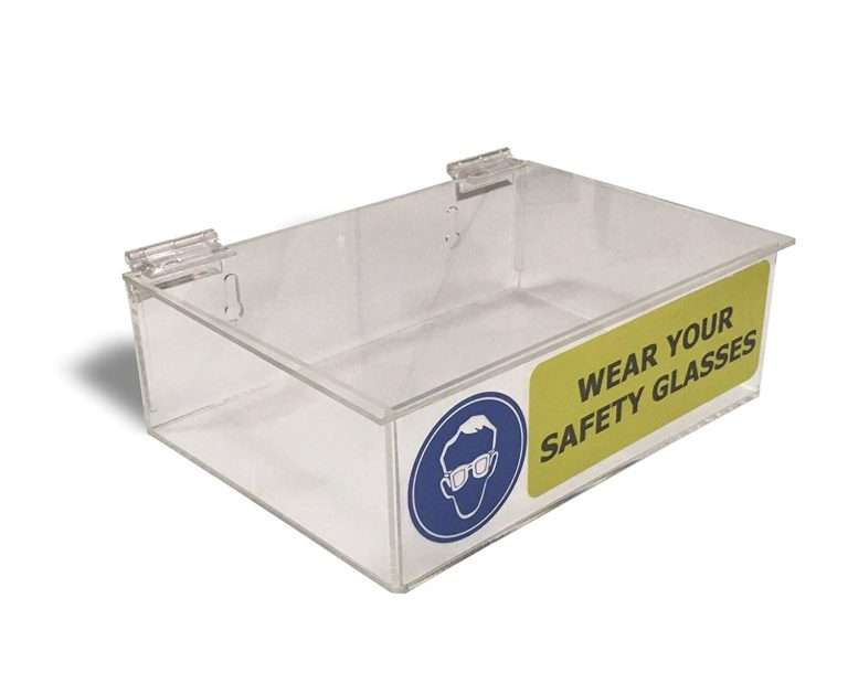
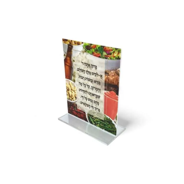
A brand graphic on an acrylic display can arrive three ways: as a label somebody sticks on, as a vinyl applique, or as ink bonded directly to the part. UV printing is the third kind — and for permanent brand presence on retail fixtures, it is usually the right answer. Here is what it actually is, the two decisions that change how it reads in store, and the artwork package that lets a printed display go straight to production instead of into an email thread.
What UV printing is on acrylic
UV printing lays ink onto the sheet and cures it with ultraviolet light in the same pass — the ink hardens onto the acrylic rather than drying into it. No label edge, no laminate seam, no carrier film: the graphic is part of the part. That matters on retail fixtures for two reasons. Visually, nothing interrupts the acrylic’s surface. Practically, there is no label corner for a stock clerk’s thumbnail to find — the graphic is as durable as its placement lets it be, which is exactly why the surface decision below matters.
Full-color work, white-only work, and combinations with other processes are all in range — a single panel can carry print, engraving, and integrated lighting when the design calls for it. Where UV print sits against screen printing and applied vinyl is its own decision, mapped in UV vs screen vs vinyl printing.
First surface or second surface: decide where the ink lives
On clear acrylic, a graphic can print on the front of the sheet (first surface) or reversed on the back, read through the material (second surface). The choice changes both the look and the life of the graphic.
- First surface puts the ink where the viewer is — maximum punch, direct color, and the right call for opaque substrates where there is no “through the material” to speak of.
- Second surface puts the acrylic itself between the world and the ink. The graphic takes on a glass-smooth depth, and every restock, wipe-down and shopping cart meets acrylic instead of ink — nothing can abrade the graphic without abrading the material protecting it. For fixtures that live hard retail lives, that is the protective choice.
Second-surface work has its own design logic — reversed art, print-order consequences, where it wins — covered in depth in second-surface UV printing.
White ink is the unlock on clear material
Here is the one UV-print fact that surprises almost every brand team: on clear acrylic, color printed without white behind it reads translucent. Light passes through the ink, the graphic goes pale and ghostly, and the brand red you specified looks like stained glass. Deliberate translucency is a legitimate effect — backlit panels use exactly this. But for opaque, catalog-correct brand color, the printer lays a white layer with the color.
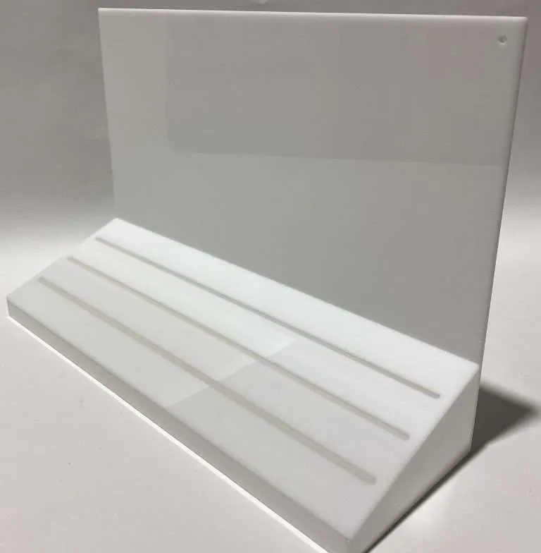
The two forms: a white flood backs the entire printed area; a white under-base backs only the graphic itself, leaving the surrounding acrylic clear. Flood when the graphic panel should read as a solid printed field; under-base when the logo should float on transparent material. This single specification changes how the display reads in store more than any other print decision — say which one you mean, or describe the effect you want and let the shop spec it.
Color without the vague promises
Brand color on acrylic is handled as color-managed CMYK printing matched to your brand references. Where the color genuinely has to be right — a launch, a brand-standards program — a proof, printed on the actual production material or supplied digitally, is the step worth building in: reviewed and approved, it becomes the reference the run is checked against. Build that review into the project timeline rather than discovering it inside the production window. How brand color behaves across a program of parts — and what “match” can honestly mean on different substrates — is the subject of brand color matching.
The artwork package that goes straight to production
The artwork package is what turns a printed-display RFQ into either a quote or an email thread. The package that goes straight to production:
- Vector art — AI, EPS or SVG — for logos and line graphics, with fonts outlined so the file carries its own typography.
- High-resolution raster — PNG or JPG — where the art is photographic, sized at or above the printed dimensions.
- Print areas dimensioned on the part drawing — where the graphic sits on the part, not just what it looks like. “Logo centered on the riser face” is a guess; a dimensioned print zone is an instruction.
- The white-ink call — flood, under-base, or “make it read opaque,” stated in the file name or the notes.
Send that package with the RFQ and the quote comes back priced on facts. The wider file conversation — what each format carries and what gets lost in translation — is in file formats and artwork handoff.
Print, engrave, or vinyl: the thirty-second decision rule
Full-color graphics and photographic art: UV print. A permanent, single-color mark that should feel machined into the part — engraving, which on acrylic is done in cast sheet because it engraves cleaner and sharper. Short-promotional-life graphics that will be swapped mid-program: applied vinyl on a printed or plain part, so the update is a peel-and-stick instead of a new part. Most display programs use two of the three somewhere, and the fixture brief is the right place to decide which goes where — the retail and POP displays page covers how printed branding fits the larger fixture program, and the complete POP guide goes deeper on program design.
The short version for your next printed fixture: decide the surface, decide the white, send vector art with a dimensioned print zone — and the graphic that shows up in stores is the one you approved.